Comparisons
Static vs Dynamic QR Codes
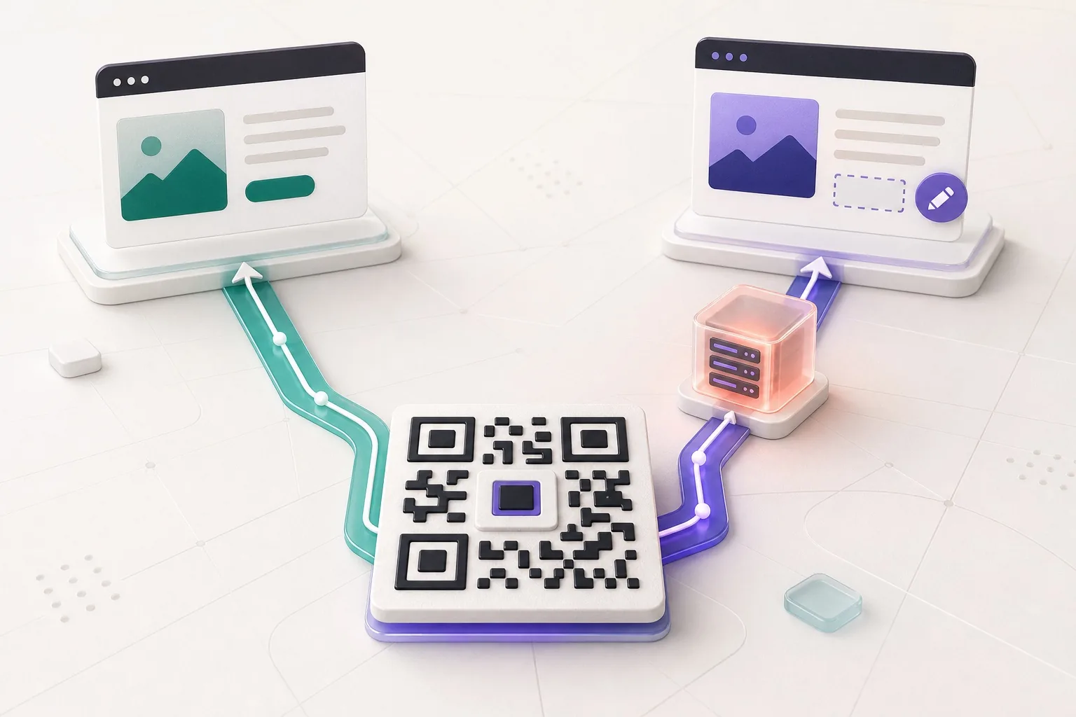
What the redirect actually buys you, measured on real encoded codes, and which payloads are worse off for it.
16 min readShaped modules, styled corners, gradients, and your own image behind the whole thing. Then the part every other artistic generator skips: the finished artwork is rasterised and read back by a decoder, and the download stays locked until it passes.
Not the plain code underneath. The artwork, with your dots and your photograph and your gradient in it, exactly as you are about to download it. Start from one of the six styles, drop a mark in the middle if you want one, and take it as SVG or PNG.
The PNG comes out of the same rasteriser that just verified the artwork, so what was tested is what gets saved.
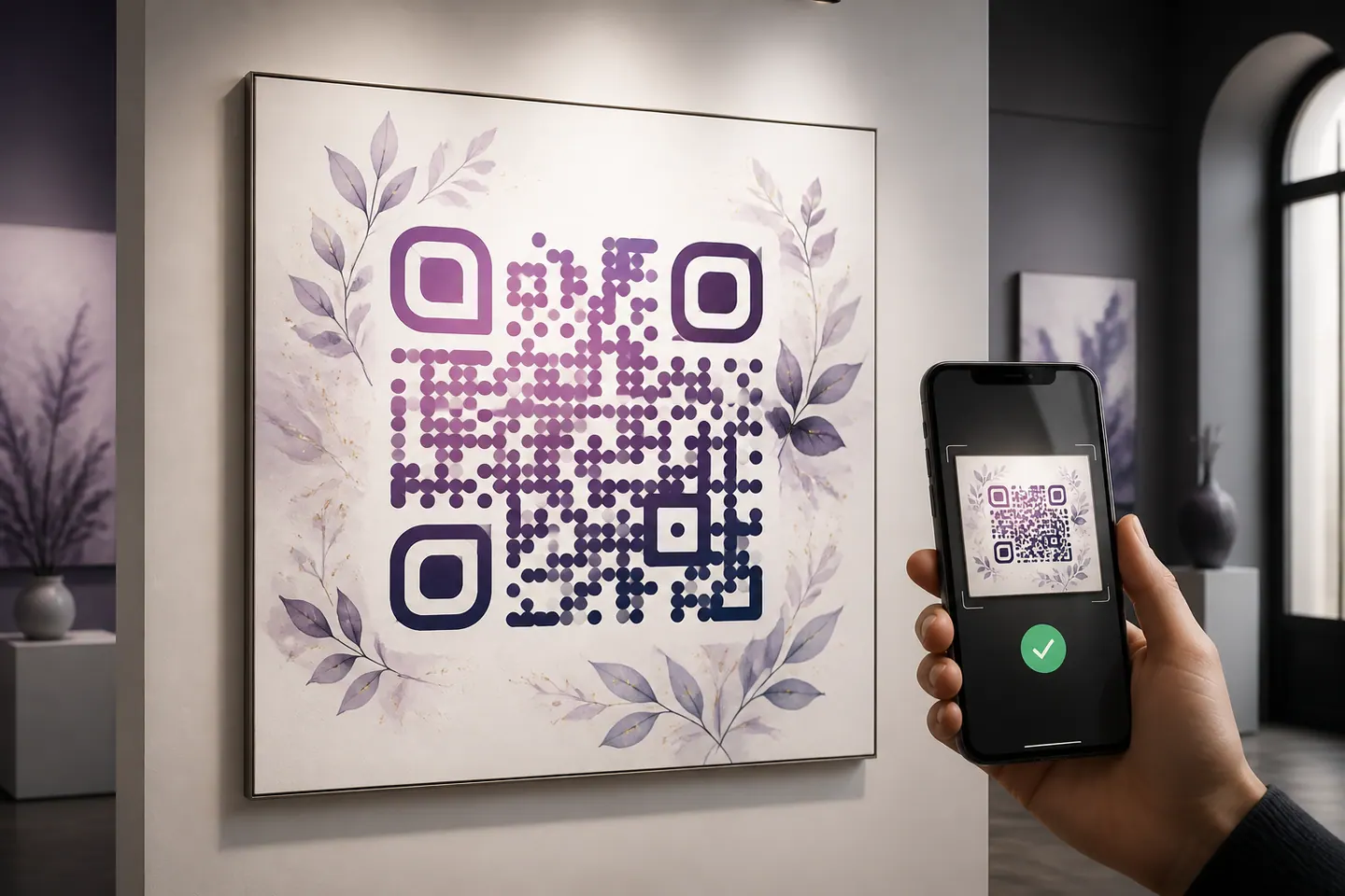
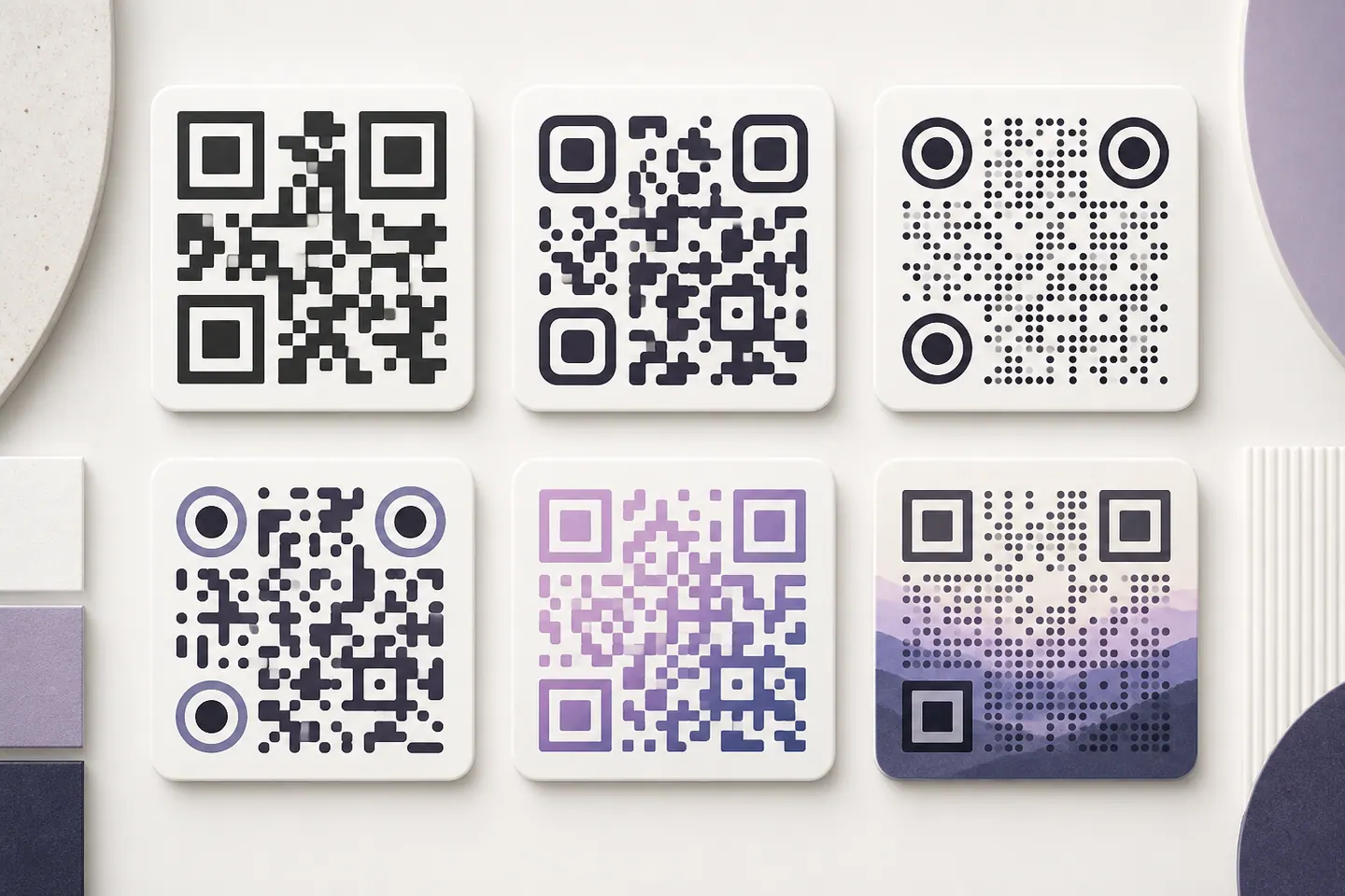
These are real codes, rendered by the same function the generator uses. Point a camera at any of them. The interesting column is not how they look, it is what each style takes away from the thing a scanner is trying to do.
Nothing artistic about it, and it is the one every other style is measured against. Full module coverage, maximum contrast.
The safest change on this page. Corners come off the modules, about 7% of the painted area goes with them, and every decoder I have pointed at it still reads it.
The look people mean by an artistic code, and the most expensive. A dot covers 79% of its cell, so the whole symbol reads lighter. Keep the contrast high to pay for it.
Check the light end of the gradient, not the average. The corners stay flat dark here on purpose, because they are the part a decoder finds first.
Two risks stacked: lighter modules and a lighter background. It survives on paper, and it is the first thing to blame if a print run fails.
Phone cameras handle this. Plenty of hardware scanners at tills and warehouses only look for dark on light, so this one is a screen and poster style, not a packaging style.
All six encode the same link at error-correction H, and the symbol under each one was decoded back when this page was built. The styling itself is the part a build cannot test, which is why the generator above rasterises your finished artwork and reads it back before it lets you download anything. Dots are the outlier worth remembering: a circle inscribed in its cell paints 79% of what a square paints, and that missing fifth is real ink on a real page.
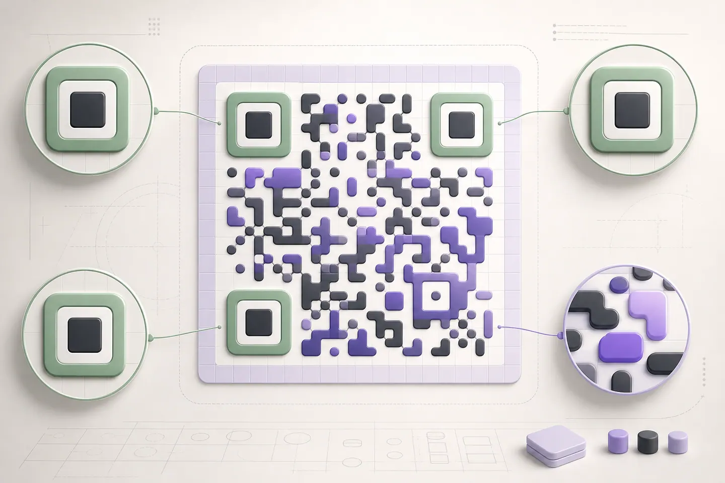
The three squares in the corners are finder patterns, and a decoder uses them before it reads any data at all. It scans lines across the image looking for a specific rhythm of dark and light, 1:1:3:1:1, and that rhythm is how it works out where the code is, how big it is and which way up. Break it and there is nothing to read, at any size, in any light.
So this tool will round them or make them circular, and it will recolour them, but it keeps the ratio, keeps them one solid colour, and draws them after everything else so no background can wash them out. Everything else is yours: module shape, gradient, opacity, the artwork underneath. That is the trade, and it is the reason a code from here fails in ways you can see rather than in ways you cannot.
The other number worth carrying around: 79%. That is how much of each cell a dot paints against a square, which is why a dotted code reads lighter to a camera and why dots are the first thing to change when a design will not scan.
Some do and some do not, which is why this page tests rather than promises. Styling changes how much ink lands in each module and how cleanly a camera separates dark from light. Dots paint about 79% of the area a square does, a gradient makes one end of the code lighter than the other, and a photograph behind the modules competes with them directly. The generator here rasterises the finished artwork and reads it back with a decoder before the download unlocks, so the answer is measured on your design rather than assumed.
The three corner squares, called finder patterns. A decoder finds them before it reads anything else, using their 1:1:3:1:1 ratio of dark and light runs. This tool lets you round them or make them circular and keeps that ratio intact, keeps them a solid colour, and draws them last so no background can wash them out. Tools that let a model paint over the corners are the reason so many artistic codes fail.
High, and this page starts there. Artistic styling spends the same redundancy that print damage spends, so you want the largest budget available. The cost is a denser symbol, which means a larger minimum print size for the same link. If your code has to be small, shorten the URL rather than dropping to Medium.
Yes. Upload it and the tool draws it under the modules with a fade you control, then tests whether the result still decodes. The fade is the whole game: too little and the picture swallows the modules, too much and there was no point using the picture. Your image is read in the tab and embedded in the SVG, never uploaded to us.
Screens are backlit and generous. Paper is not, and printing adds ink spread that thickens dark areas and eats the light gaps between shaped modules. Dots suffer most, because the gaps are already at their widest. Print a test at the size shown under the preview, scan it under the lighting the code will actually live in, and treat the on-screen pass as necessary rather than sufficient.
Colour, a logo in the middle, artwork behind it, each one measured against what still scans.
What the redirect actually buys you, measured on real encoded codes, and which payloads are worse off for it.
16 min readThe usable square inside a round sticker is 70% of its diameter. Measured minimum sizes for real links, against every common sticker size.
8 min readWhat each platform already ships, the measured cost of each payload type, and how to check an offline claim yourself.
26 min read