Comparisons
Static vs Dynamic QR Codes
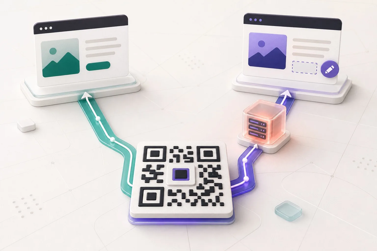
What the redirect actually buys you, measured on real encoded codes, and which payloads are worse off for it.
16 min readChange the code colour and the background, and watch the contrast ratio move as you do it. The number is the thing that decides whether it scans, not the hue.
If the pair drops below what scanners can separate, the download locks and the tool says why.
✓ Scan-tested: this code reads back correctly.
Contrast 21:1, Strong
Version 2 · 33 modules · print at least 13.2 mm wide
Advice about QR colour usually stops at "keep good contrast", which leaves you guessing about the specific colour you have to use. Here are six ordinary brand shades on white, each with its measured ratio and each rendered and read back at build time.
#1d4ed8#166534#b91c1c#c2410c#0891b2#eab308The pattern is worth naming: darkness matters and hue does not. A deep blue and a forest green behave almost identically because they sit at similar luminance. Yellow fails not because it is yellow but because it is light, and it would work well on a dark background.
If you are applying a whole visual identity rather than picking one colour, the branded code tool puts the colour, the logo and the contrast check on one screen.
Contrast is not the only thing drawing on that budget. A logo destroys modules, rounded or dotted modules remove inked area, and printing small removes margin too. Any one of them is usually fine. Three at once is where codes stop working.
Almost. What matters is the contrast between the modules and the background, not the hue. This tool measures the ratio as you type and refuses the download below about 3:1, which is where most scanners stop reading reliably.
Above 3:1 to scan at all, above 4.5:1 to survive print and poor lighting, and 7:1 or better for real margin. Plain black on white is 21:1, so a brand colour is always spending some of that budget. The tool shows the number for your exact pair.
It often works on a phone, and some older hardware scanners only look for dark-on-light and will not read an inverted code at all. The tool warns you when your colours are inverted. If the code is going somewhere public, test it on real devices first.
Yellow on white is around 1.2:1, far below what any scanner needs. Yellow is one of the few colours that fails outright rather than being marginal. On a dark background it can work well, which is the inversion trade above.
Indirectly. Lower contrast eats the same margin that a small print size eats, so a low-contrast code needs to be printed larger than a black one carrying the same data. The minimum width under the preview assumes good contrast.
Colour, a logo in the middle, artwork behind it, each one measured against what still scans.
What the redirect actually buys you, measured on real encoded codes, and which payloads are worse off for it.
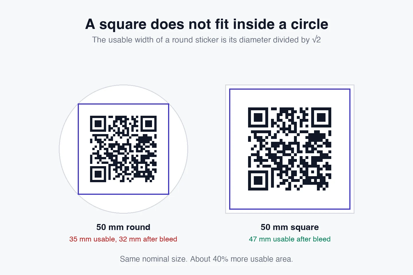
16 min readThe usable square inside a round sticker is 70% of its diameter. Measured minimum sizes for real links, against every common sticker size.
8 min readWhat each platform already ships, the measured cost of each payload type, and how to check an offline claim yourself.
26 min read