Comparisons
Static vs Dynamic QR Codes
What the redirect actually buys you, measured on real encoded codes, and which payloads are worse off for it.
16 min readPut your brand colour in the modules and your logo in the centre, then get an SVG that a print shop can use. Contrast is measured as you pick colours, logo size is capped at what error correction can rebuild, and no branded QR code can be downloaded until a decoder has read it back.
✓ Scan-tested: this code reads back correctly.
Contrast 7.9:1, Strong
Version 3 · 37 modules · print at least 14.8 mm wide
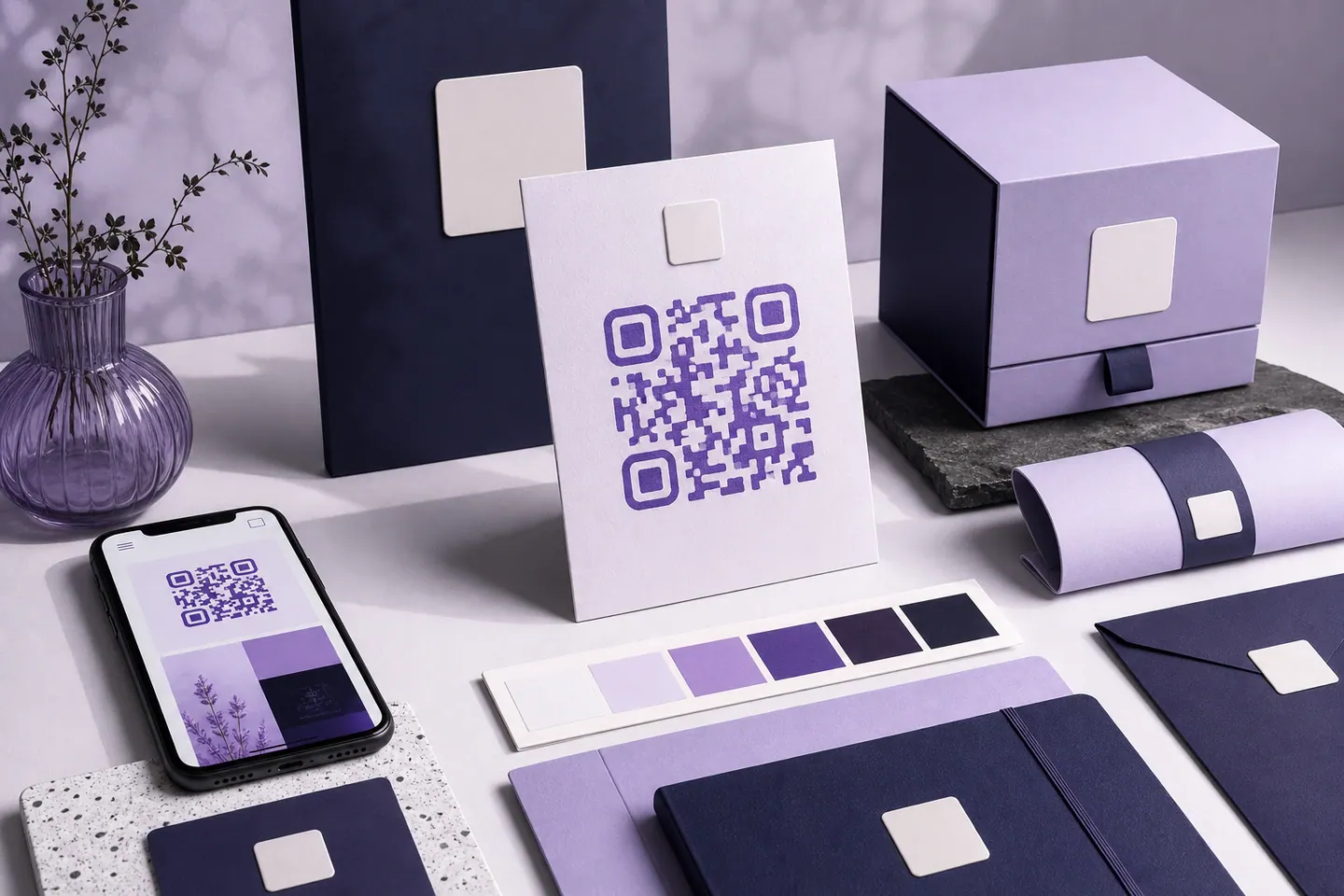
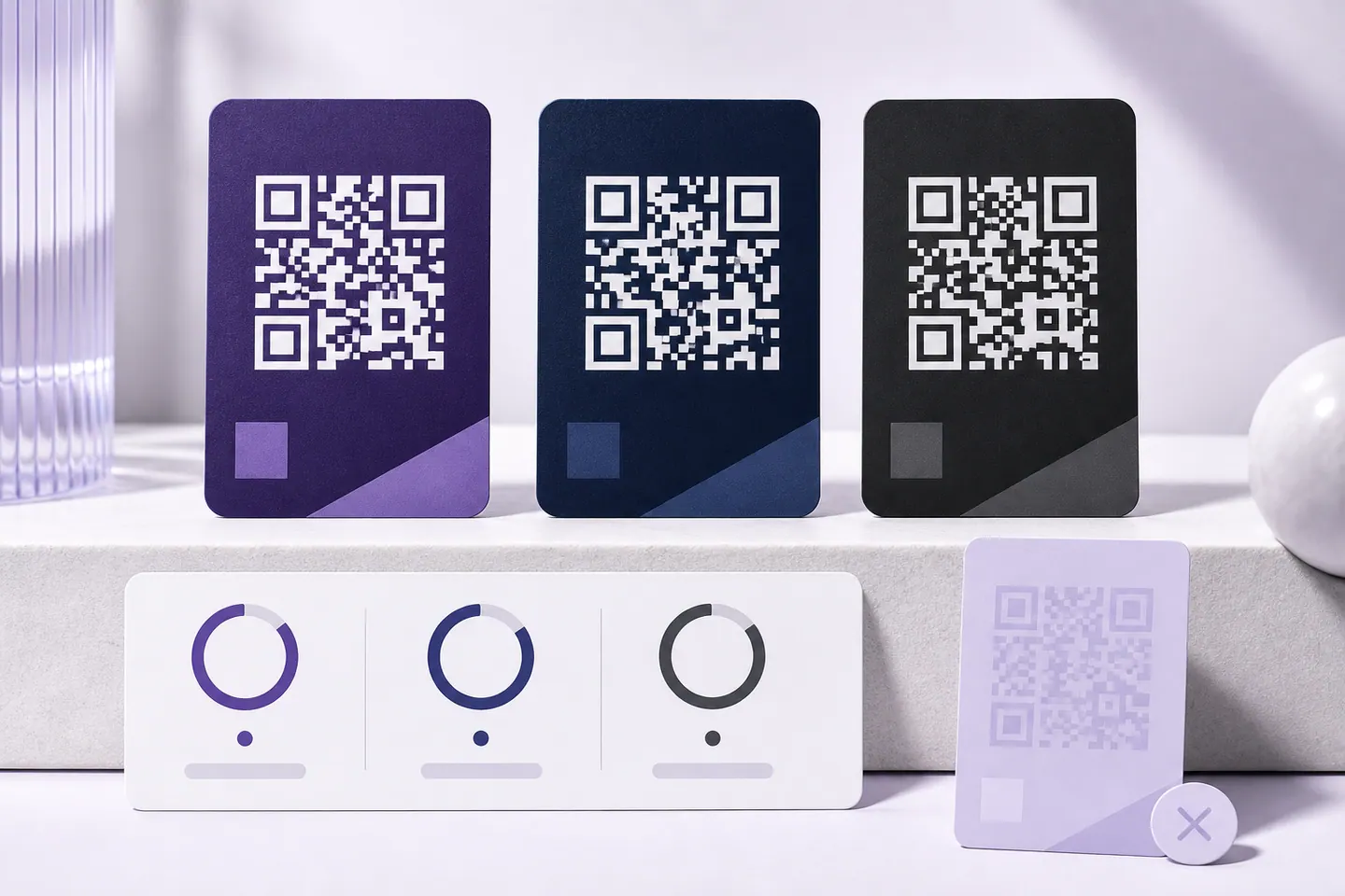
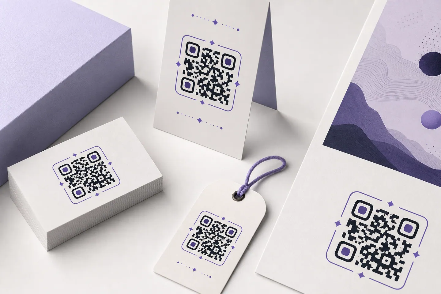
Three separate things get called QR code branding, and they have very different costs. Colour is free. A logo is not: it destroys data and spends the margin that keeps a code readable once it is folded, scuffed or photographed badly. The frame is the layer that most reliably increases scans and the one people skip.
A brand palette is chosen for logos and headlines, where a mid-tone reads beautifully. A QR symbol is a machine-vision target, and the scanner separates modules from paper by luminance alone. That is why a brand colour can look perfect on screen and fail on the printed menu, and why the fix is almost never “use black”, but a darker shade of the same hue.
Softer than black, no reliability cost.
The classic tech-brand blue-violet.
Corporate blue, a shade under the safe mark.
Reads well on white, poorly on warm stock.
Use #ac1e1e instead, same hue, 7.1:1. The code above is drawn in that shade.
Mid-tone green, lighter than a camera can use.
Use #036647 instead, same hue, 7.01:1. The code above is drawn in that shade.
Vivid but light; margin is thin in print.
Use #a61e5a instead, same hue, 7.11:1. The code above is drawn in that shade.
Too light as a module colour on white.
Use #085e85 instead, same hue, 7.12:1. The code above is drawn in that shade.
A camera cannot separate this from paper.
Use #7b4f06 instead, same hue, 7.09:1. The code above is drawn in that shade.
Ratios are WCAG contrast against white, measured when this page was built. Anything at 7:1 or above has margin to spare; between 4.5:1 and 7:1 a code scans from a screen but gets fragile on paper, under warm lighting or behind glass; below 4.5:1 a camera struggles to tell a module from the page at all. Light modules on a dark background are a separate problem: many hardware scanners only look for dark-on-light and will not read an inverted symbol however strong the contrast is.
The editor above runs this same check on whatever colours you pick, live, and refuses the download outright if the finished symbol cannot be decoded back. Your background matters just as much as the module colour: a tinted paper stock or a coloured card raises the floor, so re-check the pair rather than the code colour alone.
A QR symbol stores every byte more than once. That redundancy is error correction, and it is what lets a code still read when part of it is covered. A centred logo deliberately destroys modules and asks error correction to rebuild them, but the same budget has to cover ink spread on cheap paper, a fold through a flyer, a scuffed sticker and a phone camera at an angle in bad light.
So the safe logo width is capped per correction level rather than left to a slider you can drag until the code silently breaks. At High (the level this page starts you on), that cap is about 25% of the symbol’s width; at Quartile it is 20%, and at Medium 15%. Push past it and the tool tells you, then blocks the download when the decoder can no longer read the result.
For the full detail on logo shapes, padding and file formats, the QR code with logo page covers just that layer. If the question is specifically how much of the centre the mark can take before the code stops decoding, that is measured per link on the logo in the middle page.
The failure mode of branded QR codes at scale is not a code that will not scan. It is forty codes made by six people over two years, in four shades of the brand blue, three of them cropped into the quiet zone by a designer who thought the white margin was padding. Write these six lines into the brand guide and most of that disappears.
The quiet zone is worth repeating: 4 modules of clear space is a requirement of ISO/IEC 18004, not a design preference. It is set for you in the editor and preserved in every export, so the only way to lose it is to crop the file afterwards.
They get compared as alternatives, but they work at different moments. A branded short link is what someone reads, trusts and types, on a desktop, in an email, in a caption. A branded QR code is what someone points a camera at when the thing carrying it is physical: a poster, a menu, a package, a badge.
Used together they help each other. Encoding a short branded link instead of a long tracked URL means fewer characters, a lower symbol version, fewer and therefore larger modules, which means a smaller minimum print size and more tolerance for your logo. Printing the same short link in text under the code also gives people who cannot or will not scan a way through. If you have to choose only one, the deciding question is not which is better, but whether your audience meets the link on a screen or on a surface.
Each part of the look has a page of its own, with the measurement that governs it. The colour tool scores a palette against the contrast floor, the module shape tool shows what rounding costs a scanner, and the transparent tool tests a background-free code on five surfaces. They all draw on one budget, so spend it on the one that matters most to the brand.
A QR code carrying your visual identity instead of the default black-on-white square: your colour in the modules, your logo on a cleared patch in the centre, and usually a frame with a call to action around it. The data it encodes is identical either way: branding changes how the symbol looks, not what a scanner reads out of it.
They do when the two things that actually matter are respected: enough contrast between module colour and background, and a logo small enough for error correction to rebuild what it covers. Both are enforced here: the colour contrast is measured, the logo size is capped for the chosen correction level, and the finished code is read back with a decoder before the download unlocks. If it will not decode, you cannot save it.
If it is dark enough. Contrast against the background is what a camera separates modules by, and a mid-tone brand colour often measures below the 4.5:1 that print and poor lighting demand. The checker on this page measures common brand hues and, where one falls short, gives the nearest darker shade of the same hue that clears the bar, so the code stays recognisably on-brand rather than reverting to black.
They solve different problems, and the strongest setup uses both. A branded short link is what people read and type on desktop; a branded QR code is what they point a camera at in the physical world. Encoding a short branded link inside the code also makes the symbol less dense, which means larger modules and more tolerance for your logo, so the two reinforce each other rather than competing.
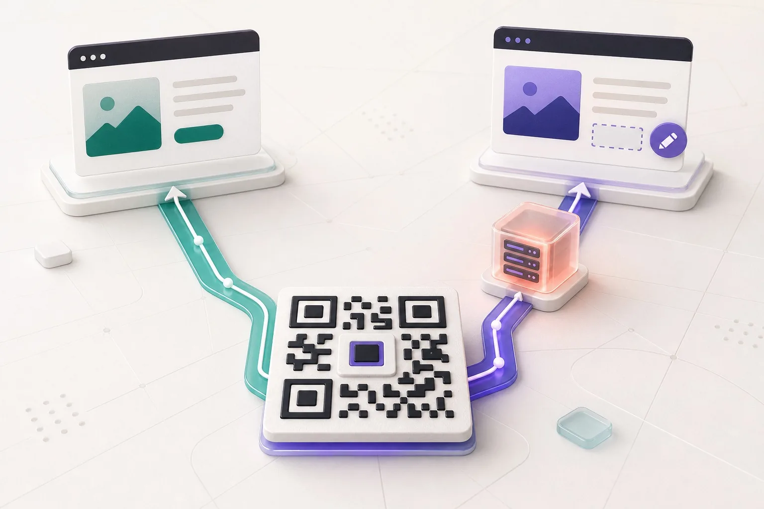
No. Branding is purely visual and applies to static codes exactly as it does to dynamic ones. Dynamic codes buy you an editable destination and scan statistics, which are worth paying for when a campaign destination might change, but nothing about your colour or logo requires them. Every code made here is static, which is also why it never expires.
The SVG. It stays sharp at any size a printer asks for, your logo is embedded inside it rather than linked, and it can be recoloured or placed into a frame in any design tool. Keep a PNG alongside it for slide decks and email, exported at the size you actually use.
At least the minimum width shown under the preview, which is calculated from the module count of your specific code at roughly 0.4mm per module. Branding does not change that number directly, but a logo spends the error-correction margin that would otherwise cover printing imperfections, so if you are near the minimum and carrying a logo, print larger.
No. The image is read in your browser, converted to a data URL there, and embedded directly into the file you download. It is never sent anywhere, there is no account, and no record of the code exists once you close the tab, so keep the file you export.
Paste your link, set your hex, drop in your logo. No account, no card, and the file is yours. QRMakery never sees the link, the logo or the finished image.
Open the generatorColour, a logo in the middle, artwork behind it, each one measured against what still scans.
What the redirect actually buys you, measured on real encoded codes, and which payloads are worse off for it.
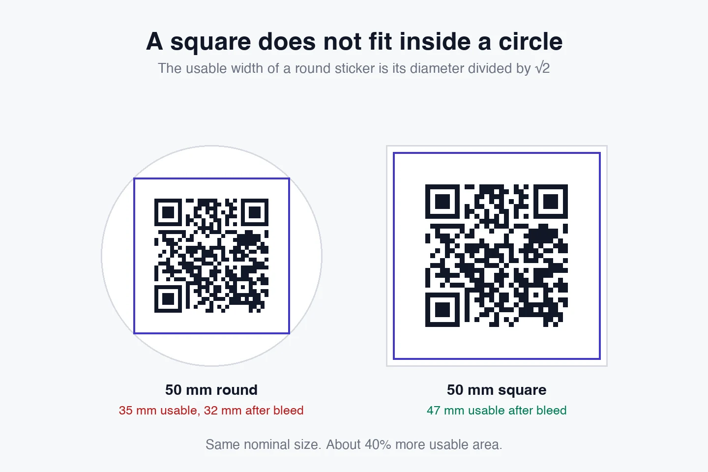
16 min readThe usable square inside a round sticker is 70% of its diameter. Measured minimum sizes for real links, against every common sticker size.
8 min readWhat each platform already ships, the measured cost of each payload type, and how to check an offline claim yourself.
26 min read