On this page9 sections
- 01Start With What Changed
- 02Contrast, and the Two Hex Values That Kill a Code
- 03The Margin Someone Cropped
- 04Light on Dark, and Why It Works for You and Not for Them
- 05Too Small for the Amount of Data in It
- 06A Logo Bigger Than Error Correction Can Rebuild
- 07Damage, and the One Part That Must Survive
- 08What These Numbers Mean, and What They Do Not
- 09Common Questions
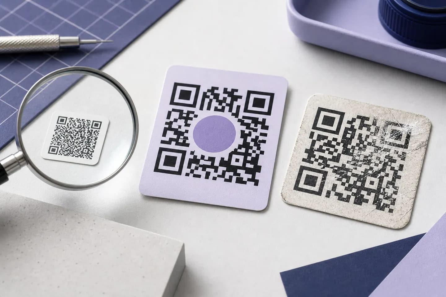
Start With What Changed
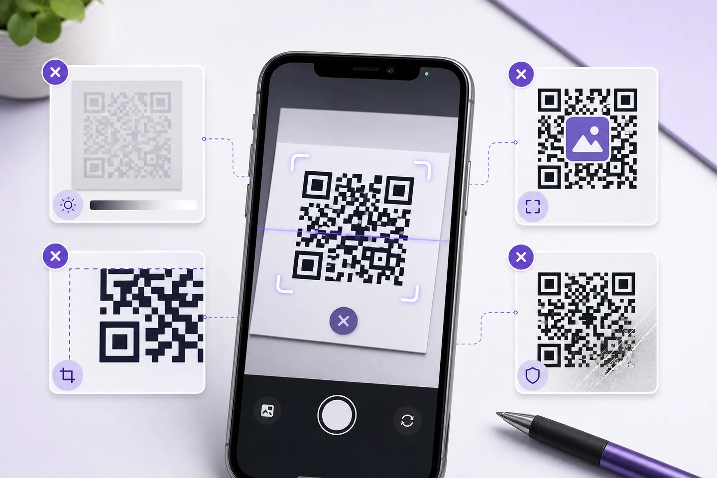
The useful question is not why QR codes fail in general. It is what is different between the case where your code works and the case where it does not. Four answers, and each one points at a different cause.
If the code you are troubleshooting exists as a file, start by putting it through the image reader. It decodes the file in your browser and reports how many pixels each module got, which separates the two cases that look identical from the outside: a badly made code, and a good code that was saved, resized or screenshotted until there was nothing left to read.
If it is the second of those, nothing on this page is your problem and you can stop here. Scanning a QR code from a screenshot covers the copy rather than the code, including the measured reason a failed decode is not proof the image is too small.
- “It has never scanned, on any device”The symbol itself is wrong, not the print. Either the colours cannot be separated or the data was mangled before encoding. Check contrast first, it is the cause with the narrowest margin.Contrast
- “It scans on screen but not on paper”Nothing about the symbol changed, so the difference is size, ink or the margin. Work out the minimum width for your module count, then check that nobody cropped the white border.The cropped margin
- “It scans on my phone but not on someone else's”You are inside the band where a good camera copes and a cheap one does not. Low contrast and inverted colours both behave like this, and both look fine to the person who chose them.Light on dark
- “It used to scan and now it does not”The symbol is physically damaged, or the destination died. A code that decodes to a dead URL is a working code with a broken link, which is a different fix.Damage
The order below is not a frequency ranking. We have no field data on how often each cause happens, and we are not going to invent one. It is ordered by how little room for error each one gives you, which is measured further down and is the more useful thing to know when you are deciding what to check first.
Contrast, and the Two Hex Values That Kill a Code
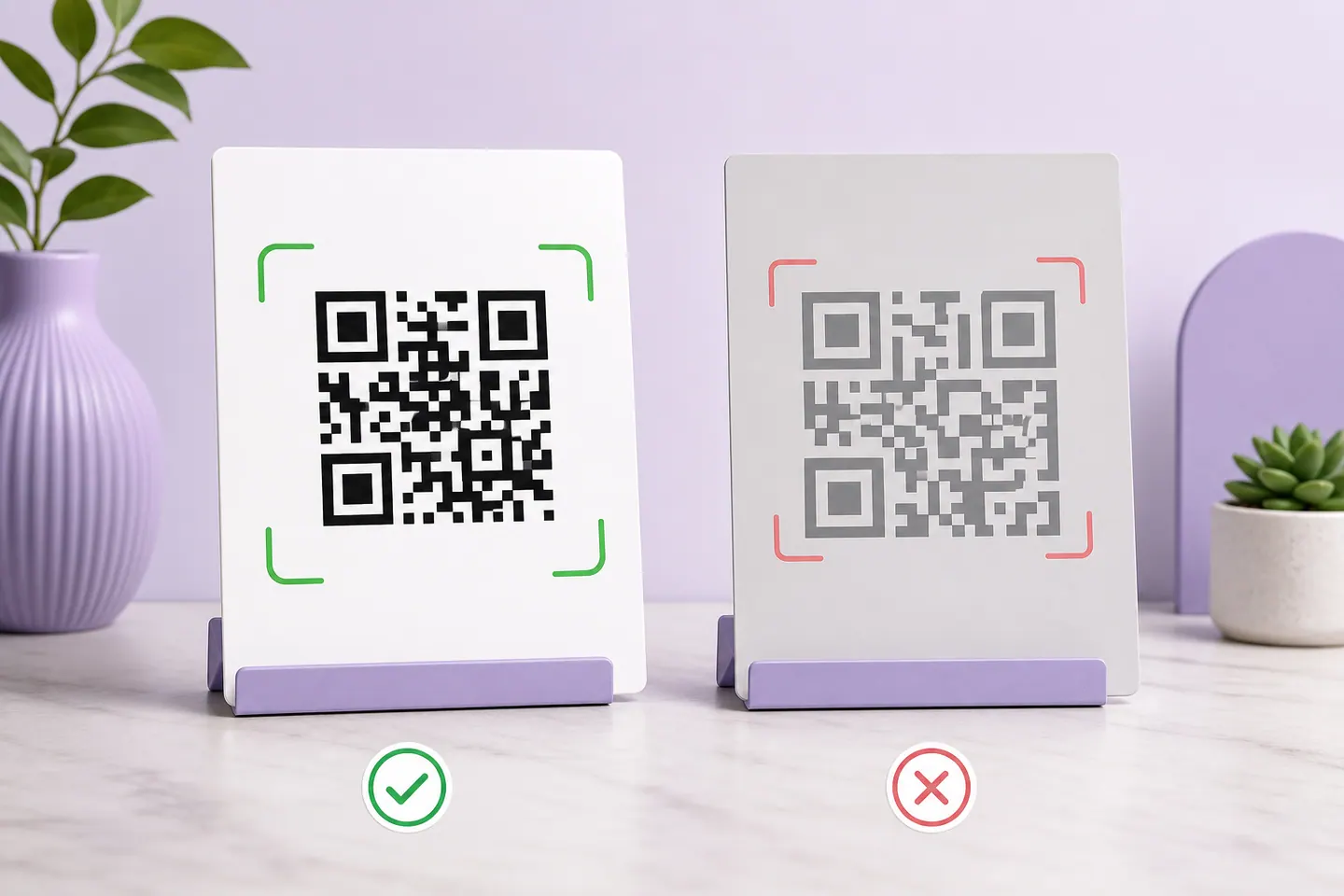
A scanner does not see your colours. It sees luminance, and it has to split every module into dark or light with no reference to what the design intended. Contrast is the margin it has to do that with, and it is measured the same way WCAG measures text contrast: black on white is 21:1, and the number falls fast as the dark colour lightens.
Below is the same code in descending contrast, encoded and decoded at build time. The interesting part is not that the light ones fail. It is how close together the last pass and the first failure are.
- #000000 on #ffffff21.00:1✓ decoded
The reference. Nothing else you do will beat it.
- #595959 on #ffffff7.00:1✓ decoded
A soft charcoal, right on the 7:1 mark. Still has margin for print.
- #7f7f7f on #ffffff4.00:1✓ decoded
Mid grey. The last row on this ladder our decoder could still read.
- #818181 on #ffffff3.90:1✗ no read
Two hex values lighter. This is where the read stops.
- #f59e0b on #ffffff2.15:1✗ no read
A real brand amber. Bright on screen, invisible to a scanner.
The editor blocks this download on the contrast grade alone.
- #0d47a1 on #1565c01.50:1✗ no read
Two shades of the same corporate blue. A designer's choice, not a scanner's.
The editor blocks this download on the contrast grade alone.
The read survives at 4.00:1 and stops at 3.90:1, on a perfect render. This site treats anything below 4.5:1 as risky and refuses to let you download below 3:1, which means the warning threshold sits just above where a flawless image gives up. That is deliberate. Every real-world factor, a camera sensor, a dim room, ink spread on uncoated stock, eats into the same margin, and none of them are present in the test above.
Two practical consequences. A brand colour that looks strong on screen, like the amber in that grid, can be unreadable as a module colour without ever looking wrong to the person who chose it. And a dark-on-dark pairing, two shades of the same corporate blue, is the worst case of all: it reads as tasteful and measures at 1.5:1. If you need to keep the brand colour, the branded QR page measures common brand hues and gives the nearest darker shade of the same hue that clears the bar.
The Margin Someone Cropped
The blank border around a QR code is part of the symbol. 4 modules on every side, specified by ISO/IEC 18004, and it is there so a decoder can tell where the code ends. It is also the first thing a designer removes, because in a layout it reads as wasted white space.
The usual advice stops there. What we measured is more specific, and it explains why cropping seems to work right up until it does not: the margin only matters when something dark is next to the code.
Dark panel#111111
- 4 modules left✓ decoded
Meets ISO/IEC 18004.
- 2 modules left✓ decoded
Below the four modules the spec asks for.
- 1 module left✓ decoded
Below the four modules the spec asks for.
- 0 modules left✗ no read
Below the four modules the spec asks for.
Mid-grey photo#8a8a8a
- 4 modules left✓ decoded
Meets ISO/IEC 18004.
- 2 modules left✓ decoded
Below the four modules the spec asks for.
- 1 module left✓ decoded
Below the four modules the spec asks for.
- 0 modules left✓ decoded
Below the four modules the spec asks for.
Against a dark panel the code survived with one module of margin and died with none. Against a mid-grey photograph it decoded with no margin at all, because the surround was light enough to act as its own quiet zone. Both results come from the same clean render, so read them as the ceiling rather than the floor.
Which is the argument for keeping all four modules rather than trusting the tolerance. You do not control what ends up adjacent to the code once the file is in someone else’s layout, and a margin that works on a grey photo fails the moment the same asset is dropped onto a navy header. The editor here sets the quiet zone at the spec minimum and preserves it in every export, so the only way to lose it is to crop the file afterwards.
Light on Dark, and Why It Works for You and Not for Them
A code with light modules on a dark background is inverted. Phone camera apps generally try both polarities and read it. Many fixed scanners, the kind on a supermarket till or a warehouse gun, only look for dark on light and will not read an inverted symbol at any size or contrast.
This is the mechanism behind the most confusing report of all: it works on my phone and not on theirs. Inversion is a hard yes or no per scanner rather than a gradual failure, so the same code can be completely reliable for one person and completely useless for another. The editor measures inversion separately from contrast and flags it, because a white-on-black code can measure 18.88:1 and still be unreadable by half the hardware in the world.
Too Small for the Amount of Data in It
Printed width is module count times module size, and module count comes from how much data you encoded. So there is no single minimum millimetre figure: a short link and a URL with a full campaign string are different codes with different floors, and the long one needs to be physically larger to stay readable.
That makes shortening the URL the cheapest fix available. It reduces the module count, which increases module size at the same printed width, which is the thing a camera actually needs. Our printing guide works the arithmetic through with measured examples for real payloads, including the scanner limits published by the format’s designers.
A Logo Bigger Than Error Correction Can Rebuild
A centred logo works by destroying modules and asking error correction to rebuild them. That budget is real but finite, and it is the same budget that absorbs scuffs, folds and bad lighting. Spend it all on the logo and you get a code that reads on a clean screen and fails on a printed menu.
Here is the same code with the patch growing past the cap, at both error-correction levels.
High correction
- 25% of the width6% of the area✓ decoded
Inside the cap the tool enforces.
- 30% of the width9% of the area✓ decoded
Past the cap. The tool warns here.
- 35% of the width12% of the area✗ no read
Past the cap. The tool warns here.
- 40% of the width16% of the area✗ no read
Past the cap. The tool warns here.
Medium correction
- 15% of the width2% of the area✓ decoded
Inside the cap the tool enforces.
- 20% of the width4% of the area✓ decoded
Past the cap. The tool warns here.
- 25% of the width6% of the area✗ no read
Past the cap. The tool warns here.
At High correction the decode survived a patch covering 30% of the width and failed at 35%. The tool caps the logo at 25% for that level, which leaves real margin in reserve on purpose. At Medium, the level most generators leave you on, the failure comes at 25%, and the cap is 15%.
Two things follow. Enlarging a logo by eye until it looks balanced is how you land in the band between decoding on screen and failing in print. And if you want a bigger mark, raise the error correction rather than pushing the size, which is what the logo tool does by defaulting to High.
Damage, and the One Part That Must Survive
Error correction is why a scuffed code still works. It is not why every scuffed code still works, and where the damage lands matters more than how big it is.
- Scuff on a finder pattern, 10% of the width✓ decoded
Survived. Part of the square is still there, which is enough to locate the symbol.
- Scuff on a finder pattern, 15%✗ no read
Dead. The decoder cannot find the code to begin reading it, and error correction never gets a turn.
- Scuff on the data corner, 18%✓ decoded
Survived. This is error correction doing the job it exists for.
- Scuff on the data corner, 20%✗ no read
Dead. Two hundredths of the width later, the budget is spent.
- Scuff along the bottom edge, 30%✓ decoded
Survived. Damage spread along an edge costs less than the same area in one corner.
- Scuff along the bottom edge, 40%✗ no read
Dead.
The three large squares in the corners are finder patterns. A decoder uses them to locate the symbol and work out its orientation before it reads a single bit of data, and they are not covered by error correction. In the tests above, damage over 15% of the width on a finder pattern killed the read, while the same damage spread along an edge survived twice that. If a code is going somewhere it will get handled, a parcel, a badge, a machine label, protect the corners first.
A code that has always been slightly marginal will also fail from damage sooner, because both draw on the same budget. That is the case for keeping contrast comfortable and the logo inside the cap even when a smaller margin would technically pass.
The finder-pattern result also decides where a code can go on something that moves. Fabric pulls hardest at the corners, which is exactly where those three squares sit, and putting a QR code on a shirt works through which panels of a garment stay flat enough to survive being worn.
What These Numbers Mean, and What They Do Not
Every case on this page is generated by this site's own encoder, rendered at 8 pixels per module, and read back with the same decoder that gates downloads in the editor. There is no blur, no glare, no skew and no ink spread, which makes it the most forgiving input a decoder can be given. Read the results that way: a case that fails here fails everywhere, and a case that passes here has only proved it can pass under laboratory conditions.
Two limits worth stating plainly. The decoder is jsQR, one implementation, and other decoders will draw their lines in slightly different places, so treat the thresholds as the shape of the problem rather than universal constants. And we have no data on how often each cause occurs in the wild, because QRMakery deliberately stores nothing about what people generate. Anyone quoting a percentage for that is guessing.
What this does replace is the guesswork about direction. If your code is at 3:1 contrast, no amount of printing it larger will help. If a logo covers 40% of it, the data underneath is gone and no scanner will recover it. Those are the answers a warning label cannot give you, and they came out of running the failure rather than describing it.
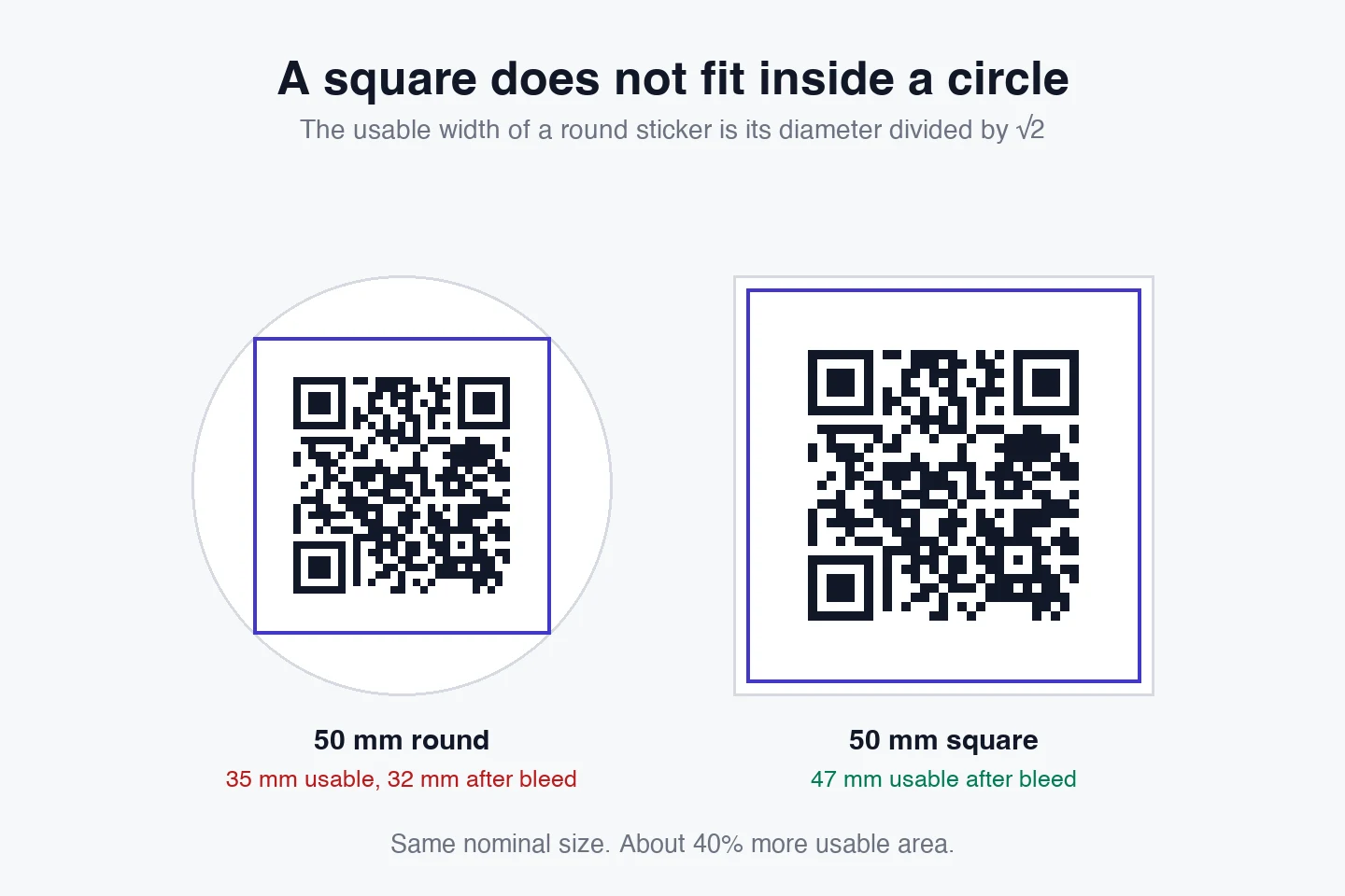
One failure this piece does not cover is geometric rather than optical: a code sized to a round sticker's diameter loses its quiet zone to the die cut. QR code sticker size has the arithmetic.
Common questions
Why will my QR code not scan?
In order of how little margin each one gives you: the contrast between the code colour and its background is too low, the white margin around the symbol has been cropped, the printed size is too small for the amount of data in it, a logo covers more than error correction can rebuild, or the code is physically damaged. Contrast is worth checking first because the failure is invisible on screen: our decoder read a mid-grey code at 4.00:1 and failed on the same code at 3.90:1, a difference of two hex values that no designer would notice.
Why does my QR code scan on my phone but not on others?
Because phone cameras are not equally good, and low contrast fails gradually rather than all at once. A recent phone with a large sensor and aggressive image processing will read a code that a cheap camera or a hardware scanner at a till cannot. Inverted codes, light modules on a dark background, behave the same way: modern phone apps usually try both polarities, while many fixed scanners only look for dark on light. If a code works for you and not for a colleague, assume it is marginal rather than fine.
Why does my QR code work on screen but not in print?
Three things change when it leaves the screen. The physical size may be below the minimum for its module count, ink spread thickens dark modules on absorbent stock, and a designer may have cropped the quiet zone to fit the layout. The first is arithmetic you can do in advance, the second is why a code near its minimum size should be printed larger, and the third is the one that surprises people, because the code looks untouched.
How much contrast does a QR code need?
Treat 4.5:1 as the floor and 7:1 as comfortable, measured the same way WCAG measures text contrast. Below 3:1 this site refuses the download outright. Those thresholds are not arbitrary: on a clean render our decoder read a grey code at 4.00:1 and failed at 3.90:1, so the 4.5:1 line sits just above the point where a perfect image stops working, which is the smallest margin worth having once you add a camera.
Does the white border around a QR code matter?
Yes, and it is part of the symbol rather than decoration. ISO/IEC 18004 asks for four modules of clear space on every side. What we measured is more nuanced than the usual advice: against a dark panel, our decoder still read the code with one module of margin left and failed with none, while against a mid-grey photograph it read the code with no margin at all. So cropping is only fatal when something dark is adjacent, which is exactly why you should not rely on it: you do not control what ends up next to the code in someone else's layout.
Can a QR code be too small to scan?
Yes, and the limit depends on how much data is in it rather than on a fixed millimetre figure. Width is module count times module size, so a longer URL means more modules and a bigger minimum. Our printing guide works the arithmetic through with measured examples. The quick version: shorten the URL before you shrink the code, because that reduces the module count instead of the module size.
Is my logo stopping the code from scanning?
It can, and the threshold is sharper than it looks. At High error correction our decoder read a code with a logo covering 30% of its width and failed at 35%. The tool caps the logo at 25% for that level, which keeps error-correction budget in reserve for the scuffs and folds a printed code will collect. At Medium, the level most tools leave you on, the decode failed at 25%. If you enlarged the logo by eye until it looked right, that is the first thing to undo.
The code scans but goes to the wrong place. Is that a scan problem?
No, that is a working code with the wrong data in it, and no amount of print quality will fix it. A static code contains the destination, so the only remedy is a new code. This is the strongest argument for encoding a short URL on a domain you control: the redirect behind it can be corrected without a reprint.
How do I test a QR code properly before printing thousands?
Print one at final size on the final stock, tape it where it will actually live, and scan it from the distance a real person will stand at, with the worst phone you can find and the lights the room actually has. Then try it at an angle and with a reflection on it. A decode test in software, including the one this site runs before every download, proves the image is readable. Only a camera in the room proves the code is usable.
Rebuild the Code and Let the Tool Check It
Contrast is measured as you pick colours, logo coverage is capped, and the download stays locked until a decoder has read the finished code back.
Open the generatorKeep reading
All guides- Comparisons
Static vs Dynamic QR Codes
What the redirect actually buys you, measured on real encoded codes, and which payloads are worse off for it.
16 min read - Printing
QR Code Sticker Size: The Circle Costs You 30%
The usable square inside a round sticker is 70% of its diameter. Measured minimum sizes for real links, against every common sticker size.
8 min read - Reference
Offline QR Code Generators for Every Device
What each platform already ships, the measured cost of each payload type, and how to check an offline claim yourself.
26 min read